The re-issue of Kenny Burrell’s Blue Note 1543 album in the audiophile series Tone Poet finally got its release. At first it was planned for June, but boy, it was worth the wait. What a brilliant release this is, both in regards of music production as of the packaging.
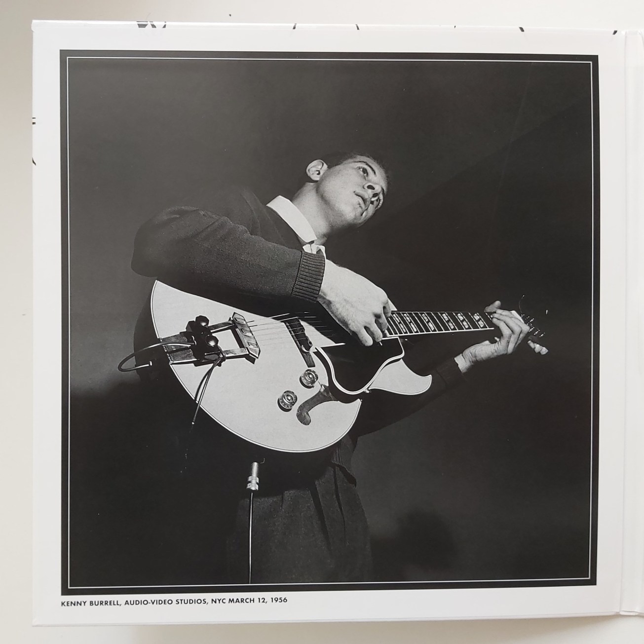
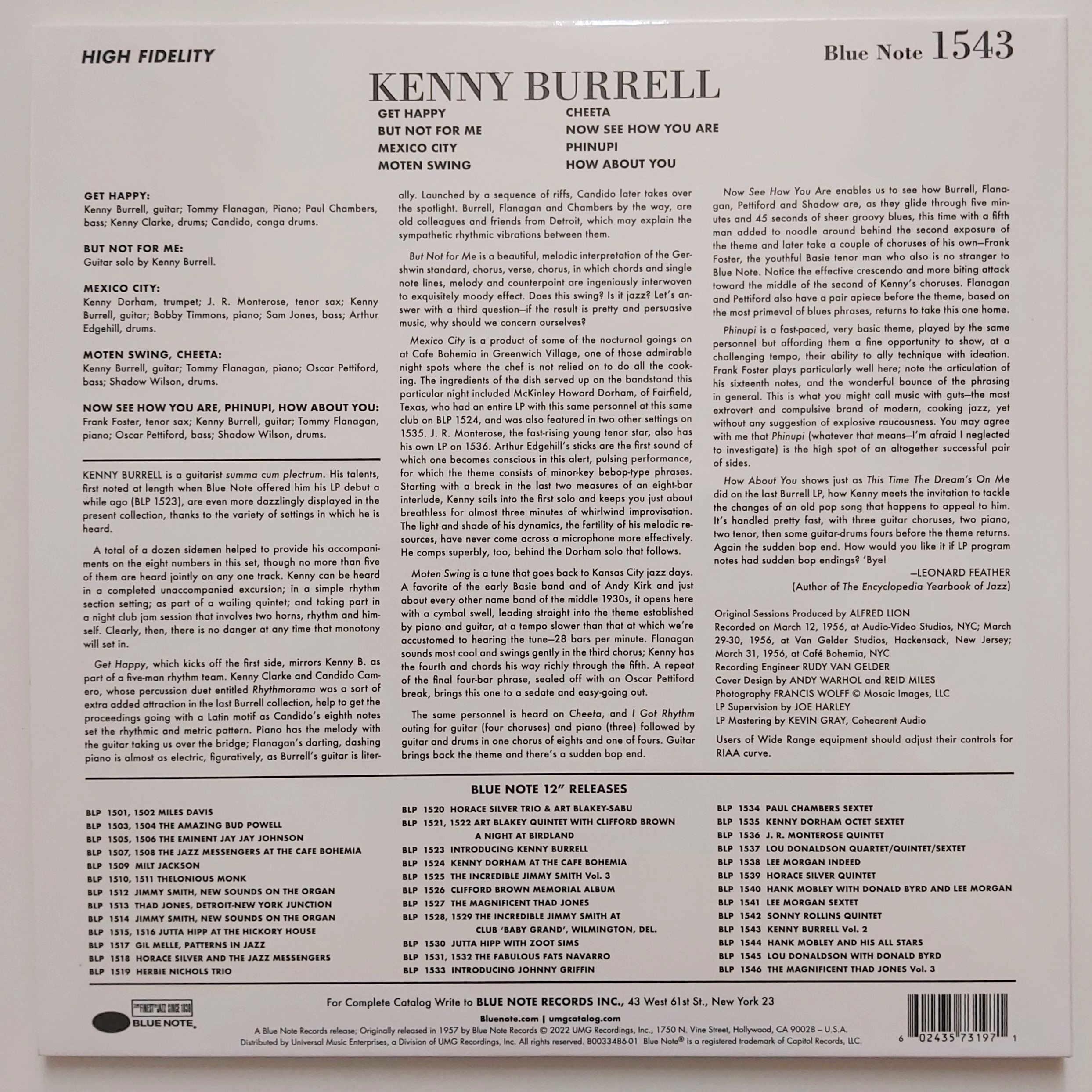
The great Reid Miles and Andy Warhol cover design was treated with the utmost respect. All releases in the Tone Poet series are packed in a sturdy and glossy gatefold cover – even if the original was a single one – of top notch quality. Original cover art and liner notes are used. The inside of the gatefold contains photos by Blue Note’s co-owner Francis Wolff, who took shots of all artists during the recording sessions. He is regarded as one of the finest jazz photographers ever. The large portrait of Kenny Burrell that’s included was taken during the recording session of this album on March 12, 1956. It is a great addition to the Warhol cover art, although it is not the photo Warhol has used to create his drawing of Burrell. That was from an earlier session, I wrote about this in a previous post. Because this album consists of material recorded at various sessions with different personnel, unfortunately not all musicians could be pictured. The ones that made the selection are pianist Tommy Flanagan, saxophone player Frank Foster, bass player Oscar Pettiford shot together with the other Blue Note label owner Alfred Lion, and the band at a live gig in Cafe Bohemia in New York (of which one tune, Mexico City, is included).


I do not have the credentials to offer you an elaborate and technical review of the production of this album. I unfortunately don’t have the best hearing anymore – damn you, tinnitus! – , nor is my record player and equipment very high end. But even I can tell you this release sounds fantastic and fresh. Rudy Van Gelder’s 1956 recording could have happened yesterday, so to say. Even the tune But Not For Me, Burrell solo on guitar, sounds as if he is playing in your living room.
Allow me to repeat myself: this is a fantastic release. I don’t usually buy recent re-releases of albums with Warhol cover art (Aretha on green vinyl, Loredana Bertè on white vinyl, Liza Minnelli on pink transparent vinyl? Nah. Pass!) But this Kenny Burrell makes me soooooo happy. This is a must have.


Thank you for this review, Guy. I generally don’t bother with reissues either and had thought that I would pass on this one. However, I changed my mind after reading your post and ordered it.
LikeLiked by 1 person
I’m sure you won’t regret it, Richard!
LikeLike
There seems to be a range of opinions on the Tone Poet re-issues. I have 5 or 6 and they all sound fantastic, so who knows? I was listening to Stanley Turrentine’s Hustlin’ this morning, with Shirley Scott and Kenny Burrell. Marvellous.
This is such a wonderful AW cover.
LikeLiked by 1 person
Hi Bruce! The only other Tone Poet I have is the new issue of Coltrane’s brilliant album Blue Train, mono. It sounds great! But so does the version I already had, a Japanese stereo press from mid Seventies. I honestly can’t say if the Tone Poet is better. I absolute luuuuuv Coltrane and enormously enjoy spinning his records, but as I wrote in my blog post I don’t think my ears are refined enough for writing about the subtle differences in pressings. That’s probably why I wisely stick to a blog on cover art! 😉
LikeLiked by 2 people
I suspect my ears are pals with yours, Guy. 😂
LikeLike