
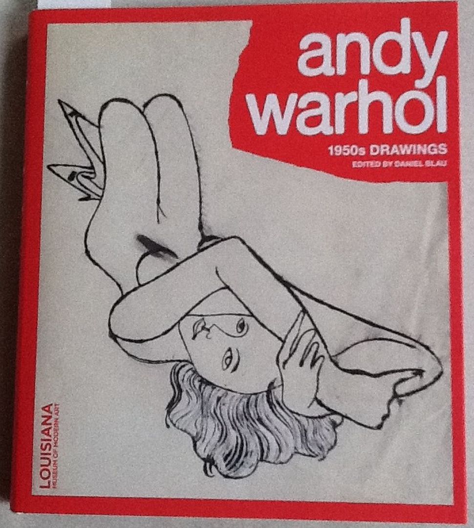
I don’t really have one favourite Warhol cover, depends on my mood. There are several I like ‘the most’. The glorious blotted line drawing for Kenny Burrell’s Blue Lights, on Blue Note records, is a serious contender anyway. I was surprised when I saw what is possibly the original drawing for this cover, at the exhibition Warhol – Early Drawings in the Louisiana in Denmark, in 2013. The drawing can also be found in the catalogue From Silverpoint To Silver Screen, which I can seriously recommend.
It seems that in the original drawing the woman’s knees were in an upward position, and not placed horizontally. So at a certain moment, the decision was made to ‘cut’ the drawing in two and turn the legs, so the full surface of the record cover could be used. It made the woman look a lot more sensual, too. I wonder who made the decision: Andy Warhol, Read Miles – a brilliant designer – , or together? They are both credited for Cover Design.
I also wonder why the color was changed for volume 2 of the album: from pink/violet on the original mono version, to dark blue on the Sixties stereo reissue. A more recent Japanese reissue is bright pink. For volume 1 on all different issues the color is more or less the same light blue.


Pingback: Kenny Burrell – Blue Lights Volume 1 | ratfab
I just discovered your website ,thanks for the research!
LikeLiked by 1 person
Thanks for your nice comment, Ashley! I hope my site can be of use to you. Greetings from Belgium.
LikeLike
Great bblog you have here
LikeLike