
The third and last Miles-Warhol project for Blue Note Records is my favorite: Blue Lights, again by Kenny Burrell, and released in two separate volumes with a different color background.
In the Fifties, records with a what now is familiarily called “cheese cake” photo on the cover, were very popular on all sorts of instrumental or orchestral albums and greatest hits collections. A beautiful sexy woman on the cover, with inviting eyes, as the perfect selling argument. The 1959 album Stretching Out by Zoot Sims just being one of the many examples.
Reid Miles also was very familiar with the phenomenon, working at the art department of Esquire. Each month the men’s magazine had a painted pin up inside, by artists like Varga, Ernest Chiriaka or Al Moore. And each year a calendar was compiled with these idealized ladies.
For the cover of Blue Lights, Reid Miles and Andy Warhol created a brilliant and gracious alternative, an illustration of a reclining woman looking you in the eye, that evokes the gentle mood of Burrell’s set on the album, and yet has nothing of the cheesiness of a real photo or a pin up painting.
At Esquire, Reid Miles had a massive archive to pick from. You now just have to google search Esquire pin up, and you’ll see. Of all the examples I looked at – it’s a tough job! – this one caught my eye: an Al Moore pin up, for the month December, in the 1949 Esquire calendar. I am not claiming this is the source for the Warhol drawing, because I can’t say that for sure, but there is a very strong possibility this is the page Reid Miles gave Warhol to work with. Again, it’s just a hunch, it could still be one of the many other very similar pin up drawings of a woman in this reclining position.

As I already wrote in a post from 2015, Warhol’s original drawing looked a bit different: the knees of the woman were directed upwards, in fact just like the Esquire calendar page. In the final designing stage, the drawing was cut in half and the knees placed horizontally.
As both Warhol and Miles are credited for design, it’s hard to tell who did this. But my bets are on Reid Miles. In an online interview, Miles associate Wayne Adams says that Miles liked to litteraly cut and paste and move things around: “Back in the day before cut and paste were computer terms, we created a generous number of images using this method. This actually dates back to his work on the album covers for Blue Note and other labels to create his designs for them. He was happiest when he had his sleeves rolled up, pushing the pieces around to create a design.”
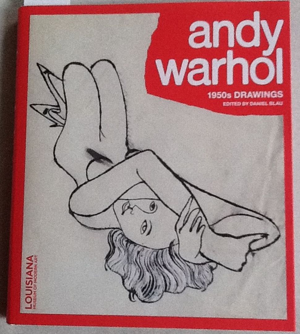
Original Warhol drawing, mirrored image and knees pointing up, on the cover of the exhibition catalogue “From Silverpoint To Silver Screen”, Daniel Blau, 2013.

