In September I travelled to Pittsburgh for events that were both deeply sad and joyful: the beautiful and touching memorial services for Matt Wrbican, the Warhol archivist who died in June at the age of 60, and the official launch of Matt’s new book A is For Archive.
In the week after the memorials, I stayed a couple of days longer because I was granted time to do research at the archives of the Andy Warhol Museum for my blog. I was hoping to find source materials, or correspondence with art directors and record companies about the album covers Warhol had designed.
While browsing through a folder with invoices and letters to and from RCA Records, a paystub from 1962 drew my attention: for a ‘record album in color LPM/LSP/2569’. This really blew my mind. The serial number was new to me, and Warhol hardly produced album covers in the Sixties. With the help of project cataloger Matt Gray, another document was quickly found: a copy of Andy Warhol’s matching invoice to art director Bob Jones at RCA, dated May 1 1962, for a “record alban (sic) in hot colors”. In pencil is written July 6, maybe the date he got paid.
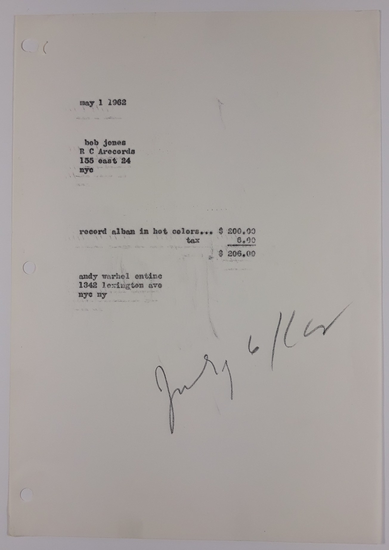
Invoice dated May 1 1962 by ‘andy warhol entinc’ – an enterprise at that time – to RCA records for a ‘record alban in hot colors’. Picture by the author, courtesy of The Andy Warhol Museum

Paystub to Warhol by the Radio Corporation of America. Picture by the author, courtesy of The Andy Warhol Museum
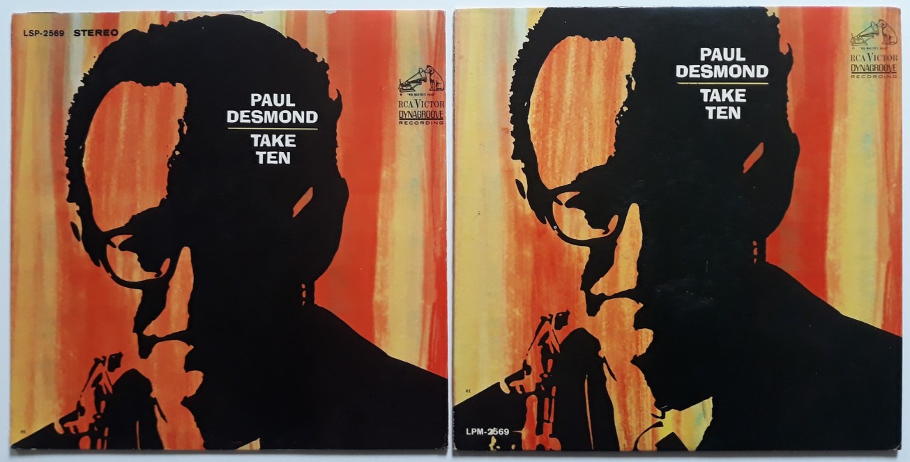
Original 1963 US issues of Take Ten, stereo (LSP-2569) and mono (LPM-2569) versions. There is a slight difference in lay out.
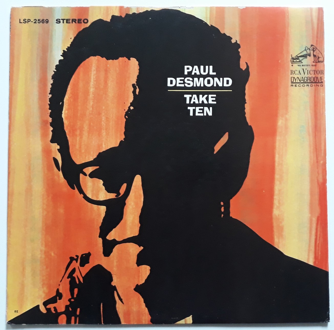
The album with the serial numbers LPM 2569 (mono) or LSP 2569 (stereo) turns out to be Take Ten, an album by Paul Desmond, the saxophone player who is world famous for being the composer and performer of the iconic jazz tune Take Five, while he was a member of the Dave Brubeck Quartet (1959). All tunes for Take Ten, an obvious follow up of that monster hit, both in name and style, were recorded at the Webster Hall, NYC, between June 5 and June 25, 1963. Very remarkable: the music was recorded a full year after Warhol was commissioned for the album art. Which shows the album had been planned very long in advance. The actual release date of Take Ten is not specified, but in the Billboard issue of Oct. 26, 1963, there is a short album review in the ‘Pop spotlight’ category. So it’s safe to say: Fall 1963.
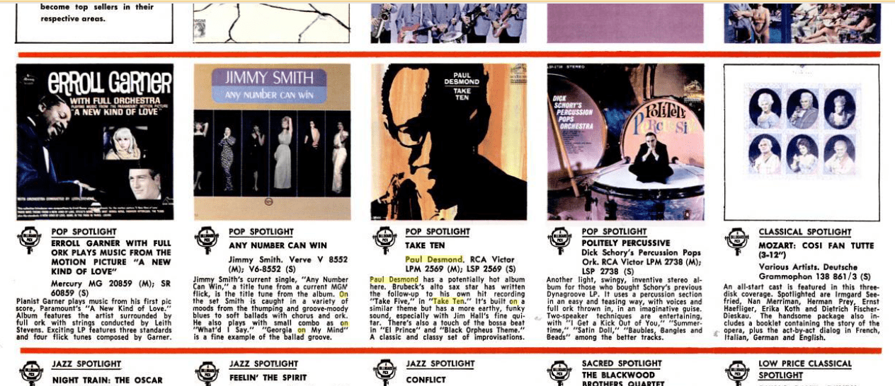
Short review in Billboard, Oct 26, 1963.
This cover cleverly managed to stay under the ‘Warhol radar’ all those years, because it’s not your typical Andy Warhol album cover art. But once you know, and have a closer look, it totally makes sense. The ‘hot’ background is painted in watercolors, similar to what Warhol did for fashion drawings for magazines in the early Sixties. Compared with the cover for the Harper’s Bazaar International Fashion Special, Fall 1962, which was with a high probability created around the same time, the color palette used for the Take Ten cover is very similar. Paul Desmond’s high contrast portrait in black – most likely screenprinted – is an early version of a technique Warhol would often use in the following years for his famous photobooth paintings. A fine example to compare with is the Today’s Teen-Agers cover for Time Magazine, January 29,1965.
On the cover of the US releases, bottom left, you will read the letters RE. This was common on RCA Victor record albums, and according to a lot of record websites this would mean ‘reissue’. But since it’s already printed on the first pressings of Take Ten, the explanation that RE stands for ‘Revised’ is more likely. According to the website Superseventies: “For RCA Victor it means that something was revised, a credit was changed, the layout of the cover was changed, something simple like that. Sometimes the first pressings of the record has an RE. They did their changes even before issuing.” Of course a sceptic can say: if it took more than a year to release the record, and there has been a revision, maybe this is not the Warhol cover anymore. But because of the obvious similarities with other Warhol works in that period, I would not follow that line of thought. Revision can also mean a different title, another font, another picture at the back, other liner notes.
As I wrote earlier, Warhol made very few record cover designs in the Sixties. 1962 was a pivotal year for Warhol, in which he finally made the giant step from being an illustrator and ‘ad man’ to the world of fine arts. In 1962 he painted his first Campbell’s soup cans, Marilyns, One Dollar Bills, Coca-Cola bottles, Elvis, he created his first serial paintings, he started screenprinting, held exhibitions at the Ferus Gallery. Pivotal! So the album cover for Take Ten, created in that same year, can be regarded as sort of missing link between Warhol’s many 1950’ies album covers with blotted line drawings, and the screenprinted 1963 pop art cover Giant Size $1.57 Each. It is rather astonishing Warhol is not credited on the Take Ten cover, especially since the album was issued a year later in 1963, and Warhol’s name by that time had grown in fame.
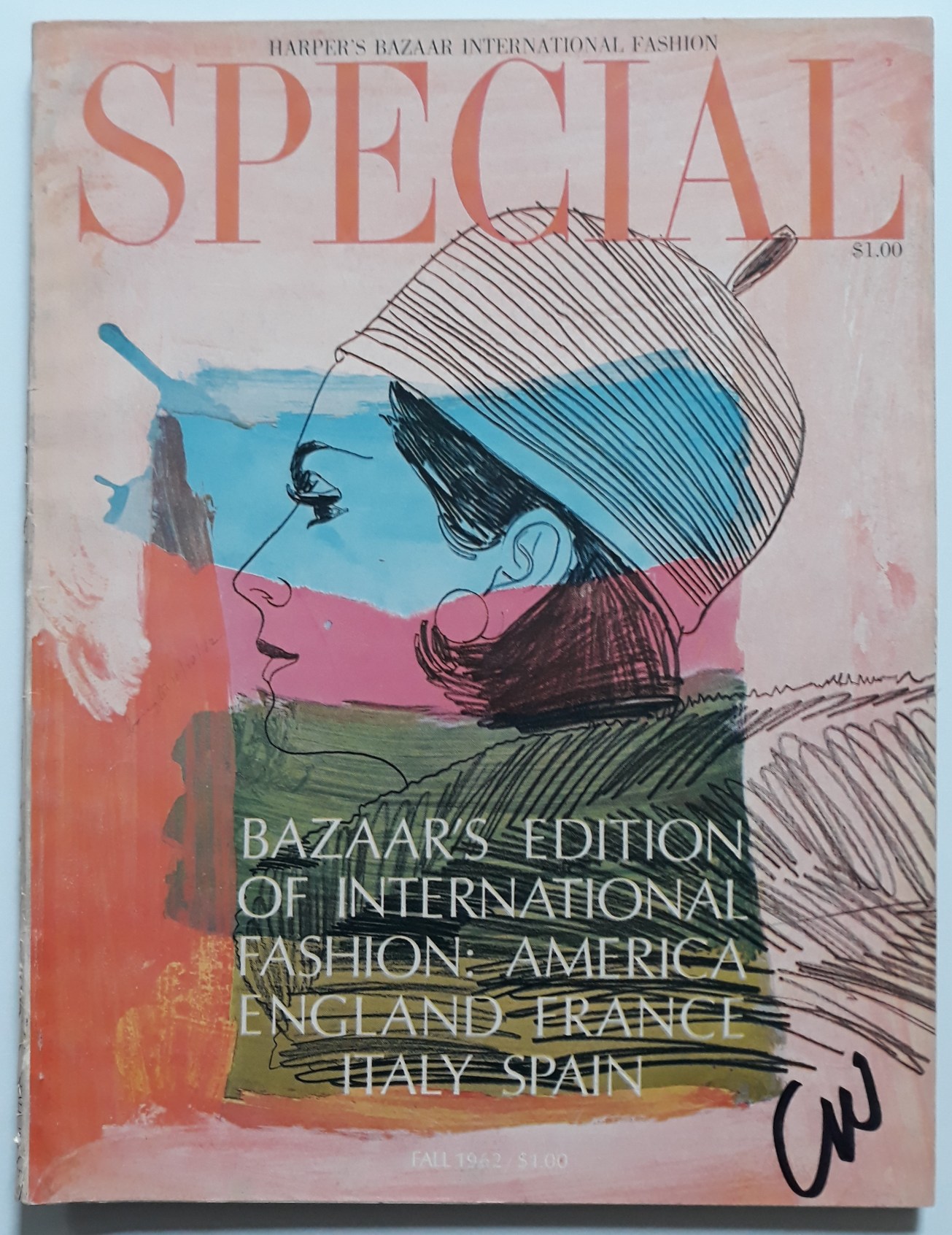
Cover for Harper’s Bazaar International Fashion Special, Fall 1962.
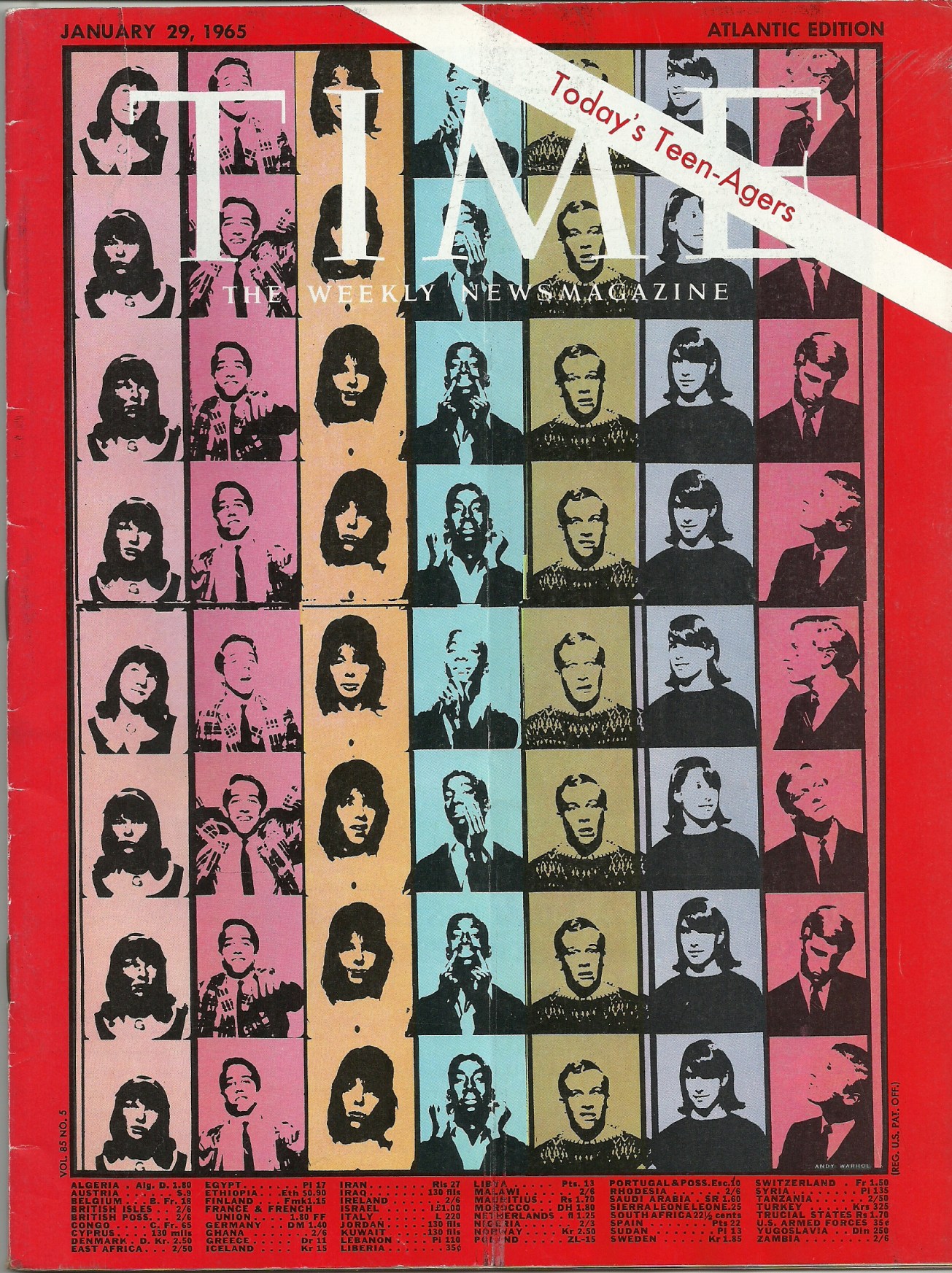
Photobooth paintings on the Today’s Teen-Agers cover for Time Magazine, January 29, 1965.
The Take Ten album didn’t match the enormous sales of Time Out, the 1959 Brubeck album with Take Five. Still it’s a highly acclaimed album, and a fan favorite among lovers of smooth jazz and bossa nova. Already in 1963, the album was released worldwide. Covers were practically the same everywhere, with minor changes like the place of the logo, titles, quality of color printing. Every few years Take Ten gets reissued, both on vinyl and cd. So it’s easy to find a new and sealed copy. But of course the cover art will look best on original 1963 cardboard cover issues.

UK edition, 1963.

Spanish edition, 1964. Song titles on the front cover.

Japanese 1980 reissue.

Guy, you’ve done it again, and it doesn’t surprise me at all. Even after all these years, I would have flipped right by this in a stack of vinyl records. Thank you so much for your tireless efforts in this still under-appreciated aspect of Warhol’s art that means so much to us. Cheers!
LikeLiked by 1 person
amazing find. thanks so much for sharing.
LikeLike
Pingback: Album Cover Hall of Fame News Update and Summary – Early November, 2019 | Album Cover Hall of Fame.com
Pingback: Avakian’s stunning note on ‘Take Ten’ | Andy Earhole
I enjoyed this article, but must point out that the famous Brubeck album featuring Take Five is titled Time Out. Also, Take Ten is not a ‘solo’ album. All tracks are recorded in a quartet setting.
LikeLiked by 1 person
Thanks for visiting my blog, and for the useful comments. I have corrected the title mistake. About the ‘solo’ aspect, you are absolutely right: Desmond releasing an album under his own name, does not make it a solo album. But on the other hand, also Lennon or McCartney albums apart from the Beatles are called solo albums, which does not mean they are the only performing artist… Then again, maybe the terminology is different in jazz, so I have changed it.
I hope you also enjoy the other entries of my blog! – Many greetings from Antwerp, Belgium!
LikeLike
Pingback: 【買取コラム特別編】芸術品としてのレコードジャケット。アートワークが持つ無限の魅力 | レコード宅配買取件数 全国1位 - NHKおはよう日本で紹介! | エコストアレコードの買取
Pingback: 【買取コラム特別編】芸術品としてのレコードジャケット。アートワークが持つ無限の魅力 – レコード買取ならエコストアレコード【公式】日本最大級のレコード買取専門店!NHK「おは
Pingback: 【買取コラム特別編】芸術品としてのレコードジャケット。アートワークが持つ無限の魅力 – レコード買取ならエコストアレコード【公式】日本最大級のレコード買取専門店!NHK「おは
Pingback: 【買取コラム特別編】芸術品としてのレコードジャケット。アートワークが持つ無限の魅力 – レコード買取ならエコストアレコード【公式】日本最大級のレコード買取専門店!NHK「おは
Thanks for sharing your discovery, and I must say it is not surprising that the Take Ten cover is by Andy Warhol.
there’s another album cover from RCA in 1966, Paul Desmond, Easy Living. I have always been intrigued by the cover art of a reclining woman with still life. But I have never managed to find out who the artist was, or indeed the model.
Any iideas?
LikeLike