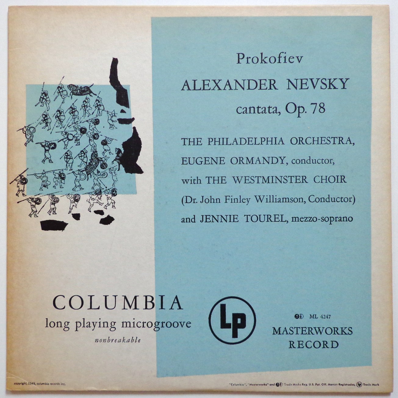
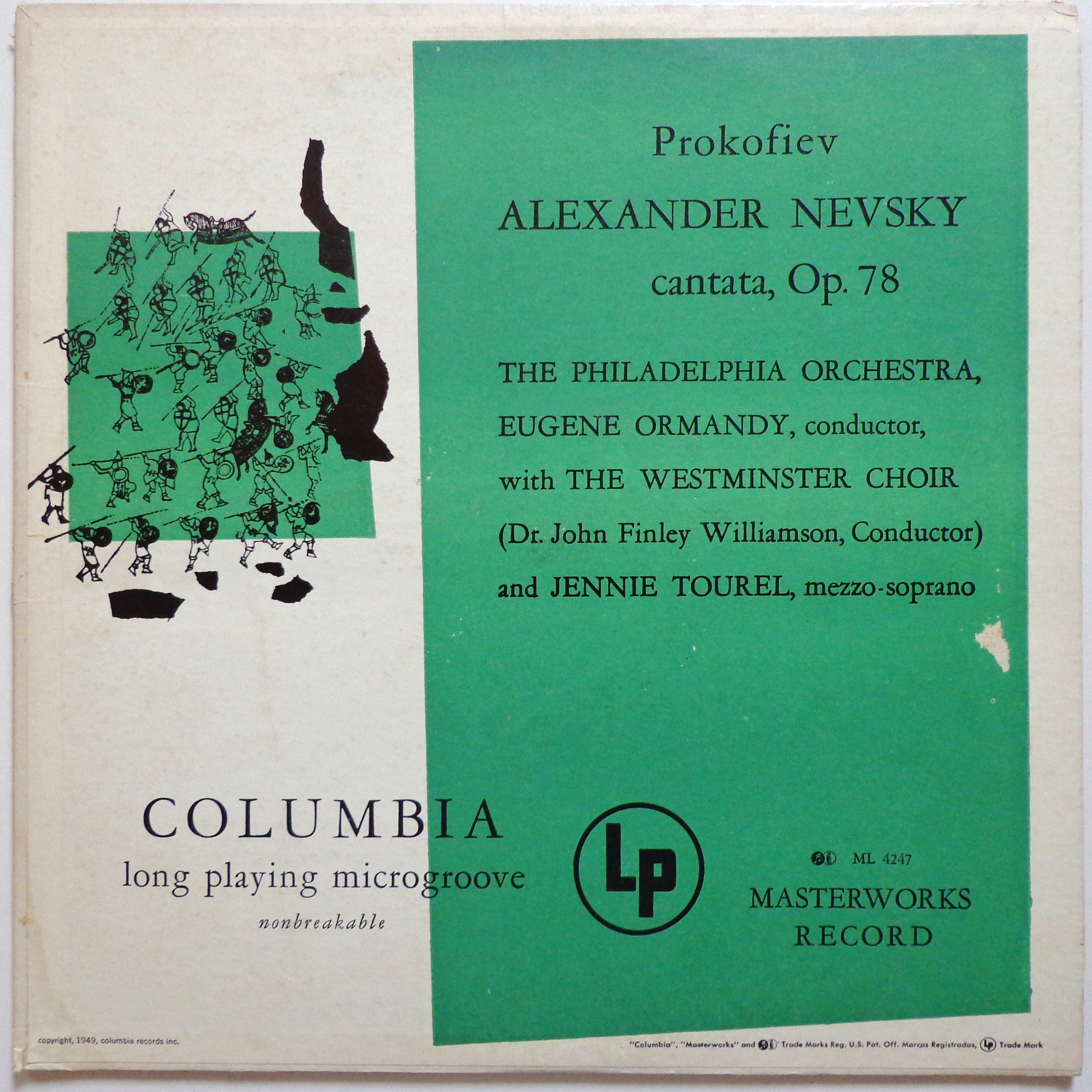
In this post we travel back to 1949, Andy Warhol’s first year as a commercial artist in New York. One of his early assignments was a drawing for the Columbia LP of Prokofiev’s ‘Alexander Nevsky’ (Masterworks Records, ML 4247), conducted by Eugene Ormandy.
Sergei Prokofiev originally wrote ‘Alexander Nevsky’ as the score for Eisenstein’s 1938 movie with the same name, about the Prince of Novgorod, who defeated the Teuton army in 1242. Prokofiev later reworked the score to a cantate for mezzo soprano, chorus and orchestra.
For the cover Warhol made a drawing of the famous Batlle On The Ice, probably based on a still or a scene from the original movie. (You can watch the Battle On The Ice scene here).
As was the case with the Mexican Music album, this album is a reissue of a recording already published before as a set of 78rpm records. And the cover of that set also had a design by Alex Steinweiss.

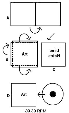
Alex Steinweiss is regarded to be the inventor of both album cover art, and LP packaging. When Columbia in 1948 introduced the vinyl LP on the new 33 1/3 speed, it was Steinweiss who came up with the concept of the LP cover, and also with the design of these early albums (colour patches and a tiny illustration). This is basically how the covers were made:
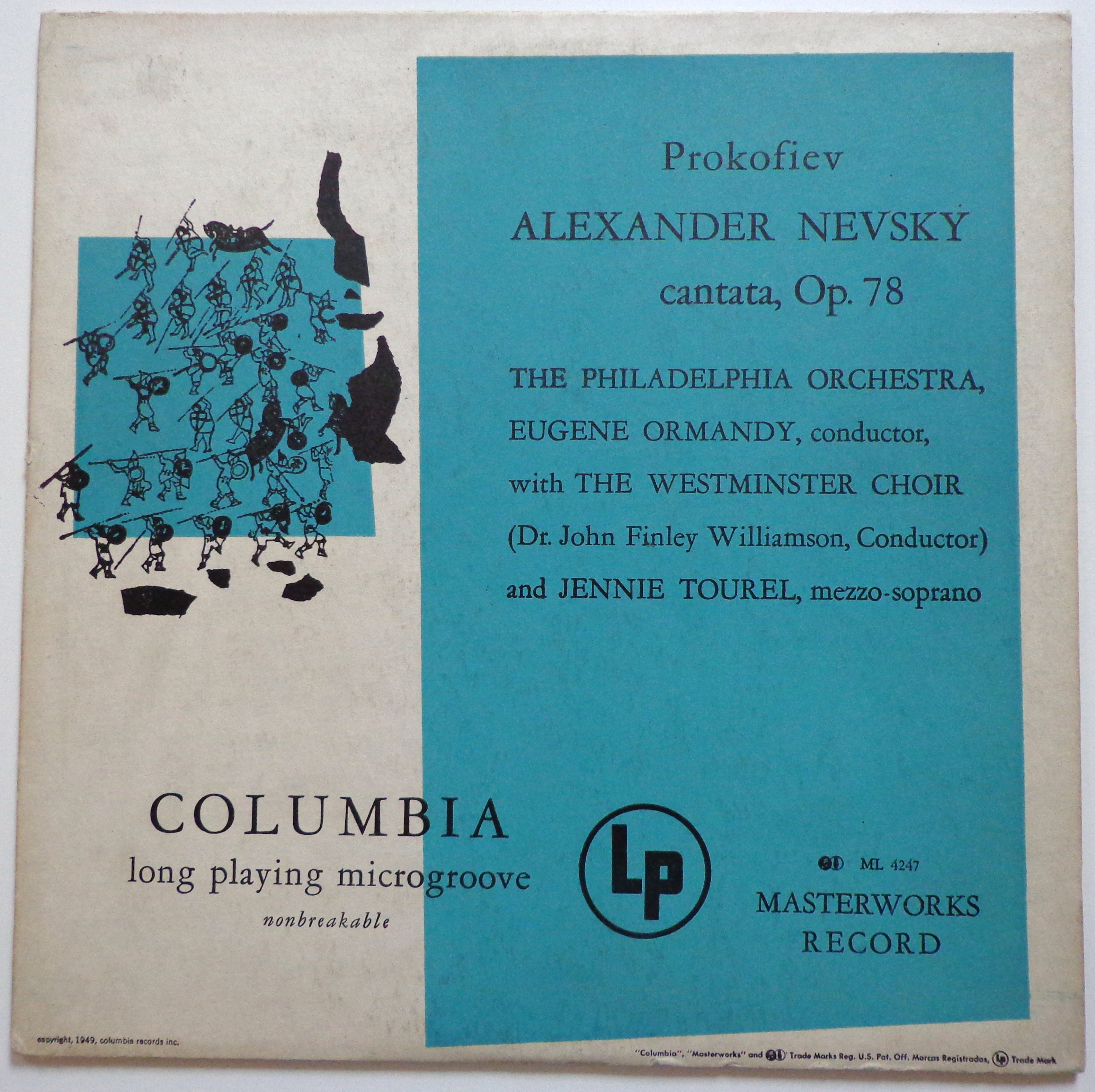
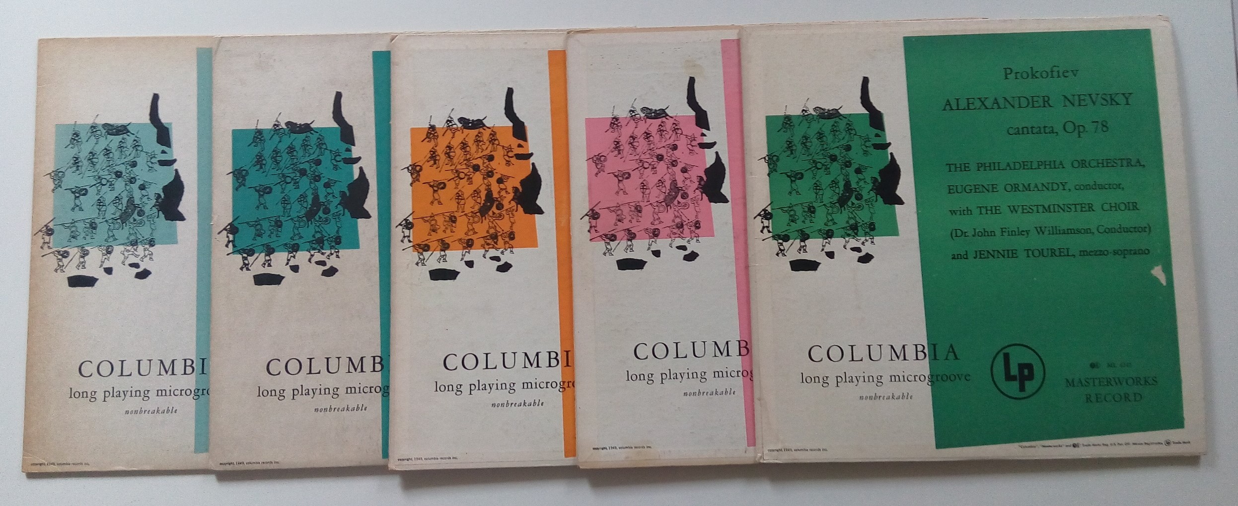
What is very interesting with Warhol’s Nevsky cover, is that because it was really a very early Columbia LP album, on different versions we can see the development of the cover packaging, changes that were made to get a better printing quality. There are basically two versions: original pressings from 1949-1950 with blue labels, and mid Fifties repressings with grey ‘6 eye’ labels.
The cover art of the original early versions from 1949 & 1950 was light blue to dark blue (or some shade in between). The front cover art was printed on a large paper with a pretty rough texture, that was folded around the cardboards. Liner notes were printed on a square paper with a smoother surface, pasted at the back. It seems to me that printing on the ‘rough’ front cover was not easy. It was difficult to get the basic colour right, and a lot of copies I’ve seen had too much black ink, which resulted in a blurry Warhol drawing. A lot of the fine detail was missing.


1949-1950

1950 and after
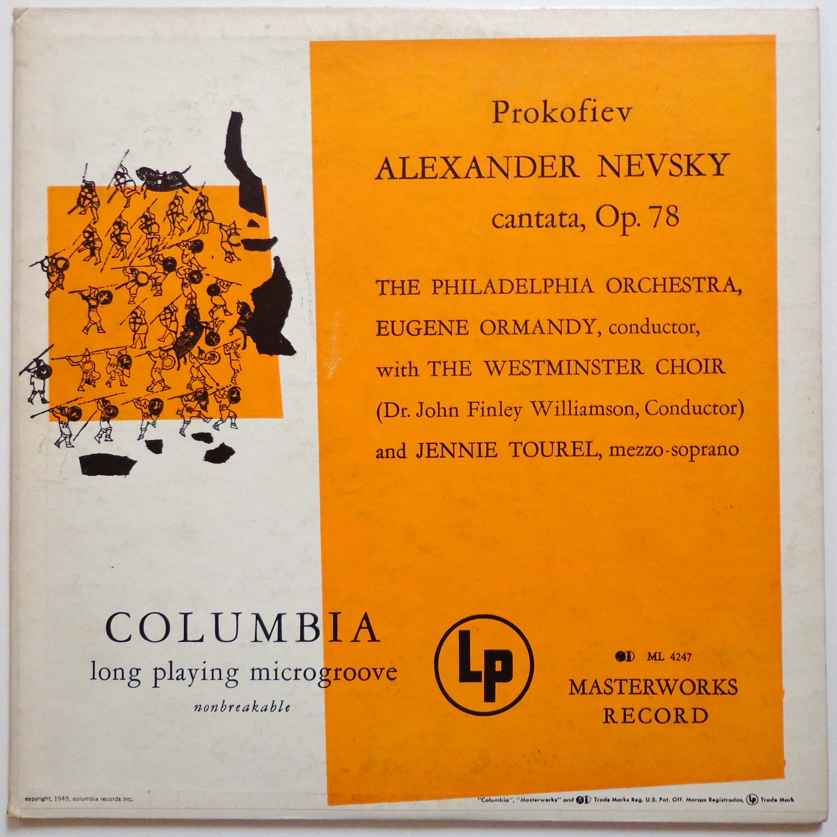
For later pressings, according to the labelography between 1955 and 1960, a different method was used. Now the larger paper that gets folded around the cardboard, is at the back with the liner notes. The paper is less rough than the one used on the early covers. Front cover artwork is printed on the smaller square paper, now pasted to the front. Printing quality is much clearer. These covers also have brighter colours: orange, pink and green. As said earlier, labels on these albums are grey with the Columbia 6 Eye logo.


1955-1960
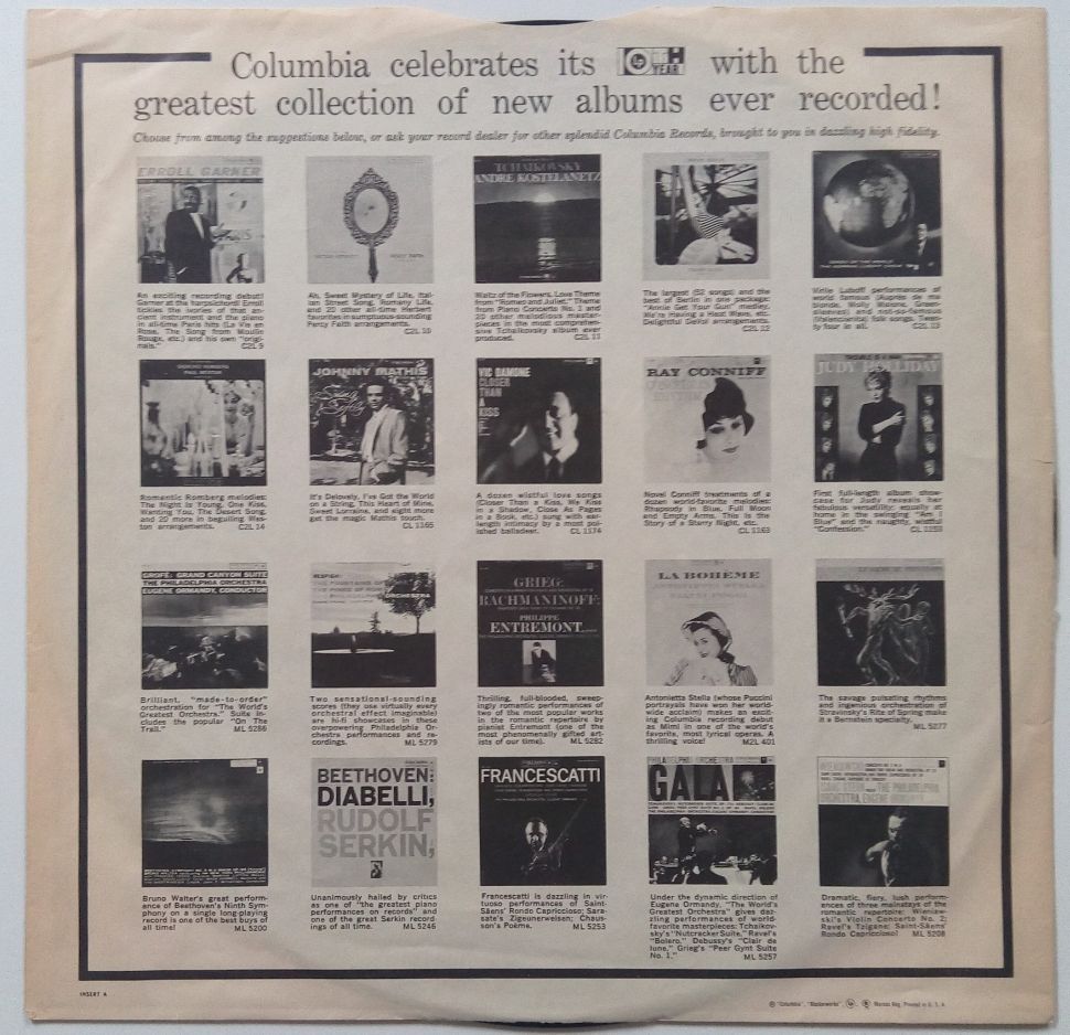
My orange copy has an inner sleeve, on which 10 years of Columbia LP’s is celebrated, which dates this sleeve to be from 1958.

This is a great description of the album, its cover and all the variations. A true reference work! Thank you.
LikeLiked by 1 person
Good stuff. Not a personal favourite but as always you do a great job providing images of all variations as well as some interesting background information, i had no idea about the movie or the printing issues.
LikeLiked by 1 person